Some of you saw the postman thread a while ago with the Orange Phantoms. I've finally had an excuse to pick up the new colour types from Cundco, so I could do some side-by-side shots with the originals.
Forgive my lighting - I was just using my camera phone under a house-hold bulb, but it gives you a pretty good idea.
I ordered them from a contact on BGG a few months ago; he's been prototyping some acrylic casts; so it's likely they will improve the in the future.
Some of the differences in colour are quite subtle, I can certainly see a few heads being scratched when playing with both colours at the same time. Greys/Purples/Blacks and Pinks and Reds end up being very similar when put side by side.
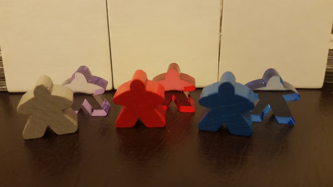
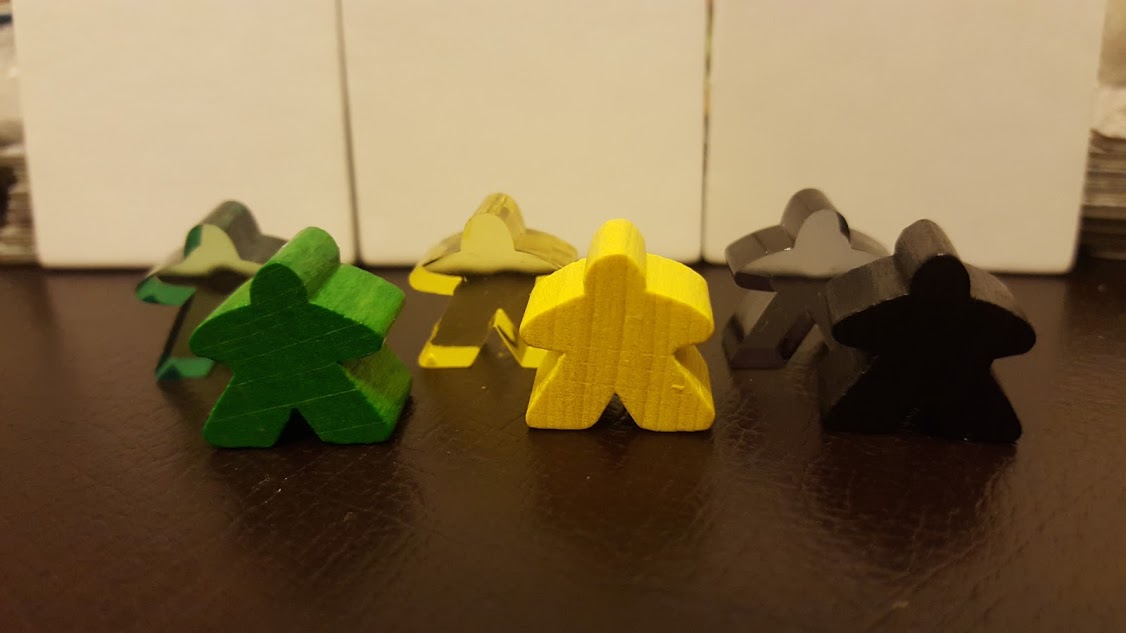
Originals:
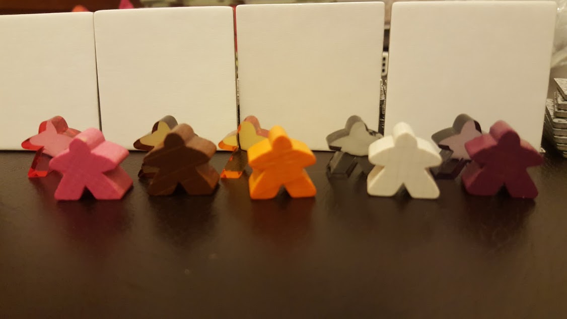
New Colours:
Pink, Brown, Orange, White, Purple
Grey & Purple:
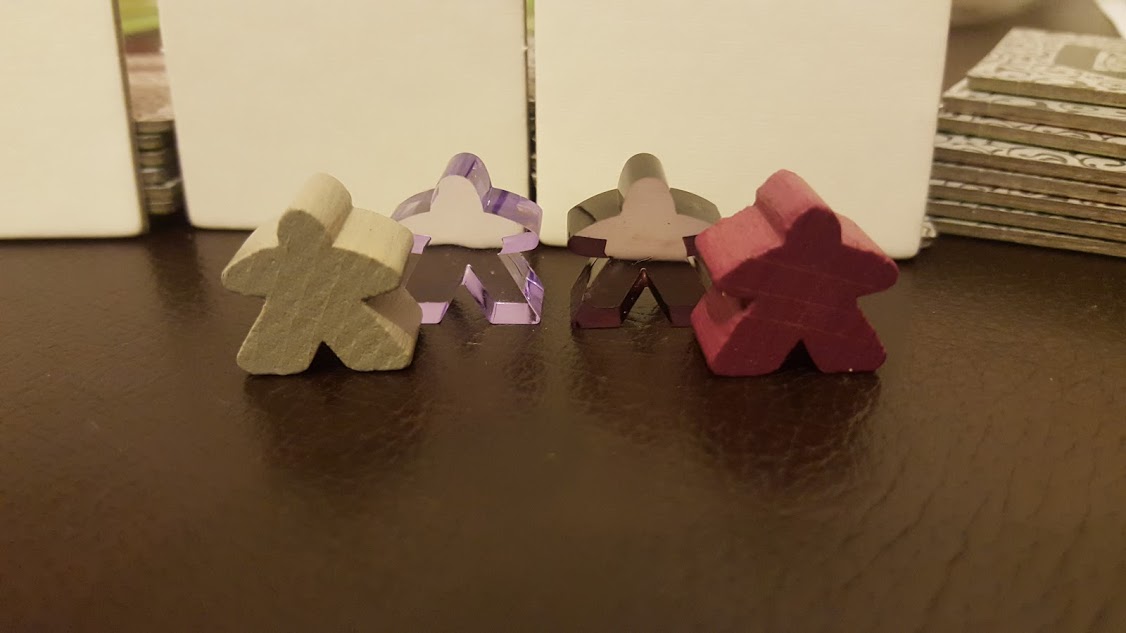
The lighting doesn't really show off the deep purple here - but I think it could work better swapped over.
Black & White:
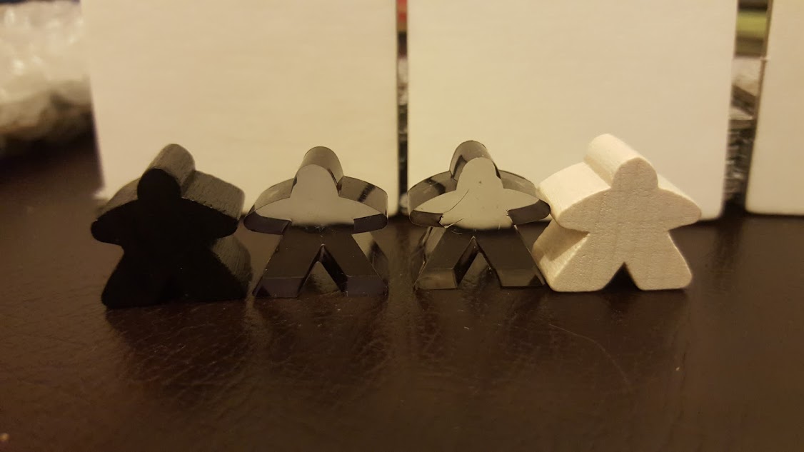
This has quite a nice effect, the White Phantom is much more see through but still have a ghostly sheen.
Pink & Red:
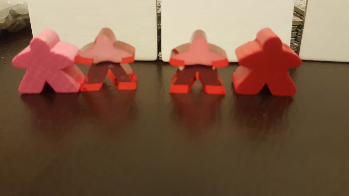
This is quite subtle and the out of focus doesn't help, but looking at the tiles in the background there's definitely a paler red.